Feeds:
Posts
Comments

The final project was a rollercoaster ride. Kecia, my group member, and I had hard time finding a story. We first wanted to work on a story about healthcare for veterans, but the bureaucracy and secrecy in the VA prevented us from pursuing that project.


We then decided to go to the public library and see if they had any issues with government funding.  Well they did have minor problems, but nothing major. However, while talking with one of the administrators at the main library in Gainesville, the issue of Archer library came up.  Archer is this really poor town that is unable to grow because it has no sewage system. We decided to visit the Archer library and as soon as we stepped in that place, we knew we had a story. 


With nothing to do in the town of Archer, the library is the place to be.  So this video explores the economic issues in the city, the need for Internet access by the people and how the library is the major hotspot in the area. 


So please check out our story and let us know what you think.

Well it is the end of the toolkit chapter, and words could not describe how grateful I am for taking both courses. In less than a year I have learned the basics of photography, audio, video and flash, and I feel that I am more than ready to take on these tasks in the real world.

For the past few years, I have been experimenting with video while working on the media committee of a Kuwaiti student organization, but most of the videos I made were informative and didn’t involve any story—the camera was always on a person speaking, and the editing was very minimal. I have to say, though, that back then I thought I was doing a great a job. 

The first day we experimented with the camera in class, however, changed that thought right a way. The 5-shot technique along with the 10 second rule of shooting opened my eyes to that art of video and film. I have already made two videos that I am really proud of, and I am pretty sure that I will continue producing more video projects.

There is no doubt the experience and knowledge gained during the last two semesters were great, but I’m asking myself these days: what’s next? I hope the school offers more courses of this sort with more advanced software and more challenging projects, but I have the feeling that will not happen soon. But since I am going to be teaching courses of this sort when I graduate, I think the best plan for me is to continue familiarizing myself with what I learned so far and try not to forget the material.

I started becoming a U.S. politics junkie ever since I had shoulder surgery in December and had to stay home for about a month to recover.  At that time, the writers’ strike was going on, so I had no choice but to follow coverage of the primaries and watch the debates.  I realized that most news networks are more focused on the horse race, polls and the characters of the candidates, and less about issues.


I got to admit that I enjoy news about character and polls more than about issues, but it is good to have a brief knowledge on where each candidate stands on some issues.


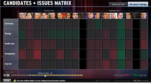
Well, MSNBC’s U.S. Presidential Candidates and Issues Matrix does just that. The best thing about this flash production is that it is very informative, yet it doesn’t use a lot of text. It gives you a very brief summary about each candidate’s position on several issues in addition to a short video clip of that candidate taking about the issue selected—what an effective way to use flash. 

obama.jpg

In addition to its multimedia functions, this flash production is also interactive.  Users can rate each candidate’s position and then submit their ratings to the matrix.  They can also view all the users’ ratings and how they fluctuated over time.


While I really enjoyed this flash feature, I have to say that it took me a few minutes before I actually figured it out.  A small introduction telling us what was going on could have been helpful.


I thought the rating scale had too many levels.  Having a smaller scale would have made it easier to comprehend for participants and viewers. In terms of the design, I thought the matrix had a great layout, but the colors used didn’t complement the layout.  The dark green and dark red on a black background were unattractive and sometimes made the matrix confusing and hard to follow.

grid.jpg


Regarding the content, I know that this flash production concentrated on issues, but adding a results feature that shows the latest results and delegate count could have complemented it.  I also noticed that Ron Paul seems to be getting most of the good reviews, which tells you something about the visitors and their intentions.


One last thing I should say is that MSNBC is one of my favorite news channels and I usually visit their Website at least once day, but I don’t recall seeing a link to this flash.  I tried locating it recently, and I still couldn’t find it. This is one aspect of news sites that I have experienced lately.  They spend a lot of time and effort in producing informative and fancy looking flash productions, yet they difficult to find and many users are not aware of them.  Advertising these features or placing them correctly could solve this problem.

I recently viewed two news videos relating to Afghanistan from the New York Times Web site: From Kabul to Prep School and The Kite Fliers of Kabul. While both videos were inspiring, I thought the one about the kite fliers had a complete story and was more interesting.


From Kabul to Prep School is about an Afghan girl who came to the United States during the war for a soccer camp. Her talent was widely received during the camp, and she was eventually awarded a scholarship to continue her education and play soccer in America.  The premise of the story—at least as I understood it from the beginning of the video—was about how the game of soccer inspired the girl’s journey from Afghanistan to the United States in a time of crisis.  But because of some immigration issues, the girl started school when the soccer season was over, so the focus of the story shifted from soccer to Afghan women and education.  This change in focus was a bit awkward and had some contradictory information.  First the narrator says the girl came from a country that deprived women an education, yet we see this girl speak in fluent English, and we later learn that she had completed high school in Kabul.  Also, in trying to explain some of the girl’s incompetence, the principal of the school says she was never exposed to a calculator. Then we find out, that because she never used a calculator, math and algebra were easy for her.


Having said all that, I am sure this girl had an exciting and inspiring story, but I felt this video didn’t showcase that story. By the way, I also thought the video was too long.


The one about the kite fliers, on the other hand, was just so beautiful. It was educational, informative, relevant to current events and fun to watch.  The video was inspired by the Kite Runner, a bestselling book turned into a movie.   The book talked about kite fighting in Afghanistan, a sport where kite flyers try to bring down other competitors’ kites. You really don’t get the concept of this activity until you actually see it, and this video does a great job in presenting it.  The best part about the video, however, was showcasing the human aspect of this sport: in a place where no green land exists, people can’t play soccer or other sports.  Their only alternative is kite fighting—and they hold a lot of passion for this activity.   Overall,  I thought the video told a complete story and was brilliantly made.

site.gif

So here is my final project for the class.  It is an extension to my soundslide 3 assignment, which was about international students’ financial struggles.  I also used Fusion Charts to create a bar graph showcasing the primary source of funds for international students in the United States.   

I hope this Web site informs others about some of the problems and issues facing foreign students.

Thanks.

Reflections on Toolkit 1

 This is my third year attending the University of Florida, and let me say that out of all the courses I have taken, Journalists Toolkit was one of, if not, the best.  I am honestly stunned at how much I learned in just 13 weeks.


I became better at picture taking as we learned the basics of photography.  Being exposed to Audacity in this class, I found out that editing audio is much easier than I thought.  Seeing the final product on soundslides was also fun and exciting to me and to my friends who viewed my projects online.  Also, the final part of the class on HTML and CSS refreshed my memories of Web design.


There is no doubt that I have enhanced my technical and practical skills, but the most important thing that I can take from this class is the art of story-telling.  This course has challenged my comfort zone, and made me think outside the box to come up with stories that truly mean something. I am really proud of the three soundslides I made so far.  Yes, many of the pictures looked good and most of the audio sounded clear, but the topics of the stories were what made the soundslides interesting and worthwhile.


I loved this course and can’t wait to start Toolkit2 next semester.     

On week 13, we talked about how to enhance Web sites using data charts and maps. We were exposed to Fusion Charts, a site that enables you to create flash charts and graphs for free, and then allows you to publish them on your Web sites.

So I just made a bar graph for my final project using Fusion Charts.  At first, it was hard for me to follow the instructions, but after several trial and errors, I was so impressed at how easy and quick it was to make a fancy looking info chart that could enhance the design and quality of your Web sites. More interesting is the fact that this service was free.     


It made me think about how many useful and free features the Internet has that we don’t really know about.  I don’t think a lot of people know about Fusion Charts and I am glad that I was one of the few who were exposed to it and who have used it.


It was hard for me to look for an issue for this assignment, but I think I hit the jackpot on this one.  My story was about some of the financial struggles that international students face during their school years in the U.S.  With the added burden of paying high tuition fees, international students are also limited by law to where and how long they can work—they can only work on-campus, 20 hours a week. 


I interviewed two students: an Indian student who shares a room with a fellow Indian in an apartment with no furniture, and a student from St. Martin who left her two sons with their grandparents because she could not afford having them with her.  I also interviewed the coordinator of international student services who summed up the problems facing international students.


Enjoy

HTML and CSS

I did previously take a class that taught me the basics of HTML and CSS, but as in almost all classes I have taken so far, I usually forget everything I learn the moment the semester ends.  This class meeting was an excellent refresher, but what grabbed my attention the most was the HTML Dog Web Site.  I was amazed at the clarity and easiness of the information and tutorials presented.   This site will be very useful to me because as you all should know by now, I will hopefully be teaching online media classes at Kuwait University when I graduate.  This site will surely make teaching HTML a whole lot easier.

Well my second soundslides are about Falafel King, one of the most popular Middle Eastern restaurants in Gainesville. My initial plan was to interview the owner, but I was surprised when I heard that he was vacationing in Lebanon.  I decided to go there and look for a good audio story.


To my luck, smiling Al was there.  He was the person who actually started Falafel King, so he talked to me about how he came up with idea and how he dealt with his customers when the restaurant first began its business more than 20 years ago.  He is quite a character, so enjoy and smile with smiling Al